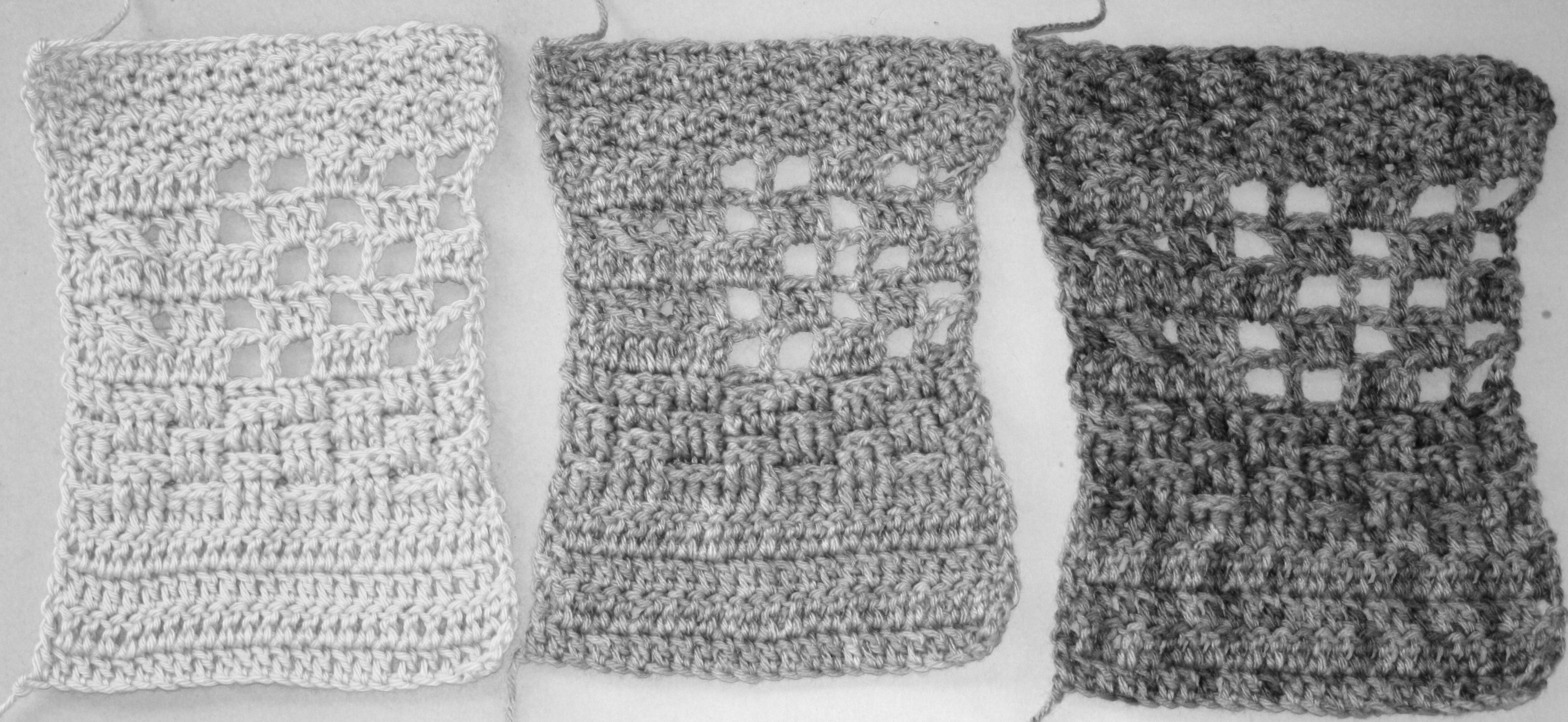
 I might take hats a bit for granted. When I was learning to crochet I never ventured into hats, after all my grandmother had crocheted several…everyone in my house had more than they needed. But in honesty, my biggest hang up with hats was working in the round.
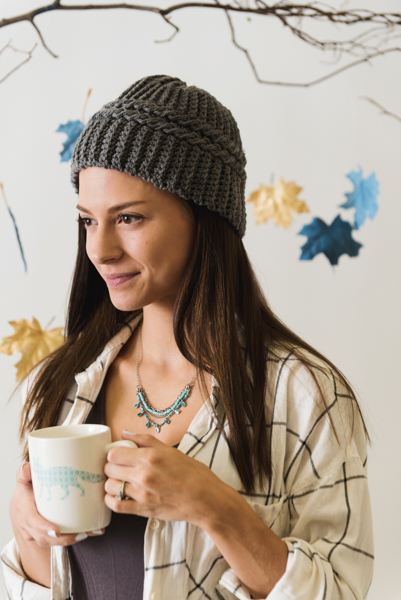
Photo courtesy Prime Publishing
The hats my grandmother created were all worked in a back and forth manner, from top to bottom as a rectangle, seamed at a side and gathered at the top. I never saw a hat worked in the round. It intimidated me.
I remember a friend of my college roommate was crocheting hats in the round and I was secretly mesmerized.
So the Homey Fireplace Hat seems pretty straight forward to me. It is worked vertically with a single crochet ribbing, but then has two cables worked in the center, all the way around. It is the same overall style that I am use to. It has a lot of stretch so it can fit just about anybody, kids to adults. This design can be found in the latest issue, October 2017, of I Like Crochet. This is an on-line magazine that offers a nice variety, but not on newsstands but your inbox instead.
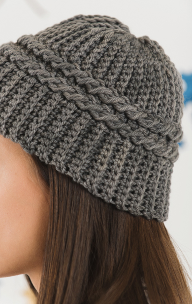
Photo courtesy Prime Publishing
The cable is a relatively simple two by one type cable, meaning that there are two stitches that are crossed over by one, and this is done twice. By working the 2 cables right next to each other it helps really set off the texture.
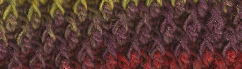
I sometimes like to see this design worked up in a variegated color, as it lends itself well to some color striping and the cables help “bleed” the color to the stripes below. The yarn in this design is called Targhee by Lisa Souza, it is available in so many different color ways that the possibilities really seem endless.
Targhee is a sheep breed, one that is growing in popularity within the United States, especially for locally produced wools. It has a nice spring to it and holds the warmth ideal for a nice hat.