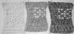
 Wow, a whole month focused on crochet! It has been fun following all the blogs featured on the Crochetville blog tour, and thank you Amy & Donna for all your hard work in pulling this together.
This year the blog tour is featuring the charitable organization of Halos of Hope. Please consider making a hat for the cause or make a financial contribution to this organization that helps many with cancer. Find more information at Halos of Hope. 
So spring is in the air, it always brings about the thoughts of color for me, which is always an inspiration. Granted I have not been living in a world of winter white, but seeing all the flowers open up and the trees beginning to bloom looks like a painters palette to me. So I grab some yarn and begin to play, but not all yarns are created equal.
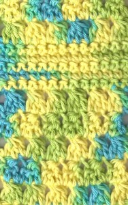
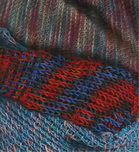
Notice the difference between the lines of color in the bottom of the swatch, double crochet clusters, and the band toward the top worked as single crochet. Different stitches, different color pooling.
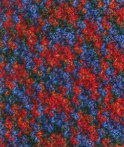
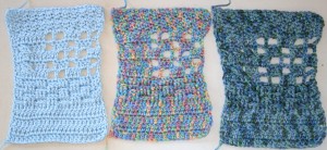
Lately I have pulled toward variegated yarns, ones that have a mixture and change of color within the skein. However the length of each color run can make a real difference in how my finished fabric looks, so I have to take it into consideration. I pulled some variegated yarn off the shelf the other day, with the inspiration of spring, but found that my fabric just looked like a bunch of speckled dots, and there was no “color pooling” that happens when colors stack up upon themselves.
Why did my work look like little specks? The stitches I was using. Most yarns are not created with crocheters as the primary user in mind, so as a result the color repeats are usually shorter then would best highlight the art of crochet stitches. Often each stitch will include more than one color resulting in speckling. However, with a little playing, stitches can be found that act a little differently. A good example of this is Tunisian crochet, that gives pooling more like that of knitting, but even changing from double crochet to single crochet can create a difference in the appearance of the fabric, and one that might be more what I am looking for.
I was playing with some hanks (the twisted up rounds of yarn that need to be unwound into a ball for easier using), that were dyed by an Independent dyer , these are businesses that are usually small in size and create beautifully colored yarns in small batches, some even painted by hand. I found the color runs of each hank to have been about a foot long, and created just a couple of stitches in each color. I asked the dyer about this, and was enlightened to learn about the process she used. She explained that to create longer color runs she would have to have a way to work with the hank either in a much longer format, or have it unwound then rewound into the hanks standard size, to be dyed/painted. Both approaches are more labor intensive and cost prohibitive. Since the yarn is so beautiful though, I think I can find a stitch that will work in complimenting it.
Basically, if you find a yarn that you love, be mindful that it may not be the best match for every pattern you find. So do a little of that dreaded word….swatching, and see how the color comes together. It really can help you find some beauty. Your crochet is your therapy, your art, your history, so help your vision come to life, use the yarns you love and work the patterns you enjoy. Do not be limited by want the photo shows or the materials listed, make each crochet moment your own.
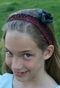
Now if you have any scarps left give my newest free pattern a try! It is a head band, which has an attached flower (worked as you go, no sewing!), so check it out Garden Flower Head Band, and find my self-published designs at Crochetville, Ravelry and Craftsy.

