 I will admit, as a long time crocheter, I used acrylic yarns almost exclusively for years. I do not say this as a negative thing, acrylic yarns have many practical purposes and companies are creating new textures of yarn with them daily, but there are other practical mediums out there that deserve attention too. However there were several reasons for my long term use of acrylic.
First, availability. In years past I could actually pick up Super Saver in the grocery store while my mom got milk and eggs. Since it was already at hand it was easier to use more regularly. However times have changed, even finding the box stores with Super Saver are getting harder to locate (or involve quite a drive to get to). However box store yarns have become more diversified and I can find fibers that would have been seen only in small local yarn stores in the past.
Secondly, I knew how to use it. A pull skein is a simple concept that involves no extra work on my part. I could pick up a skein and a hook and go right to work, with a hank I was at a loss. I did not want to look like I was confused or unskilled, so I never really picked them up. I guess I figured that if the yarn could confuse me as to how to actually start using it, things would not go well. But after meeting some local spinners and learning how yarn is created at a wheel, I learned how to handle a hank (Here is a past post that shares the explanation).
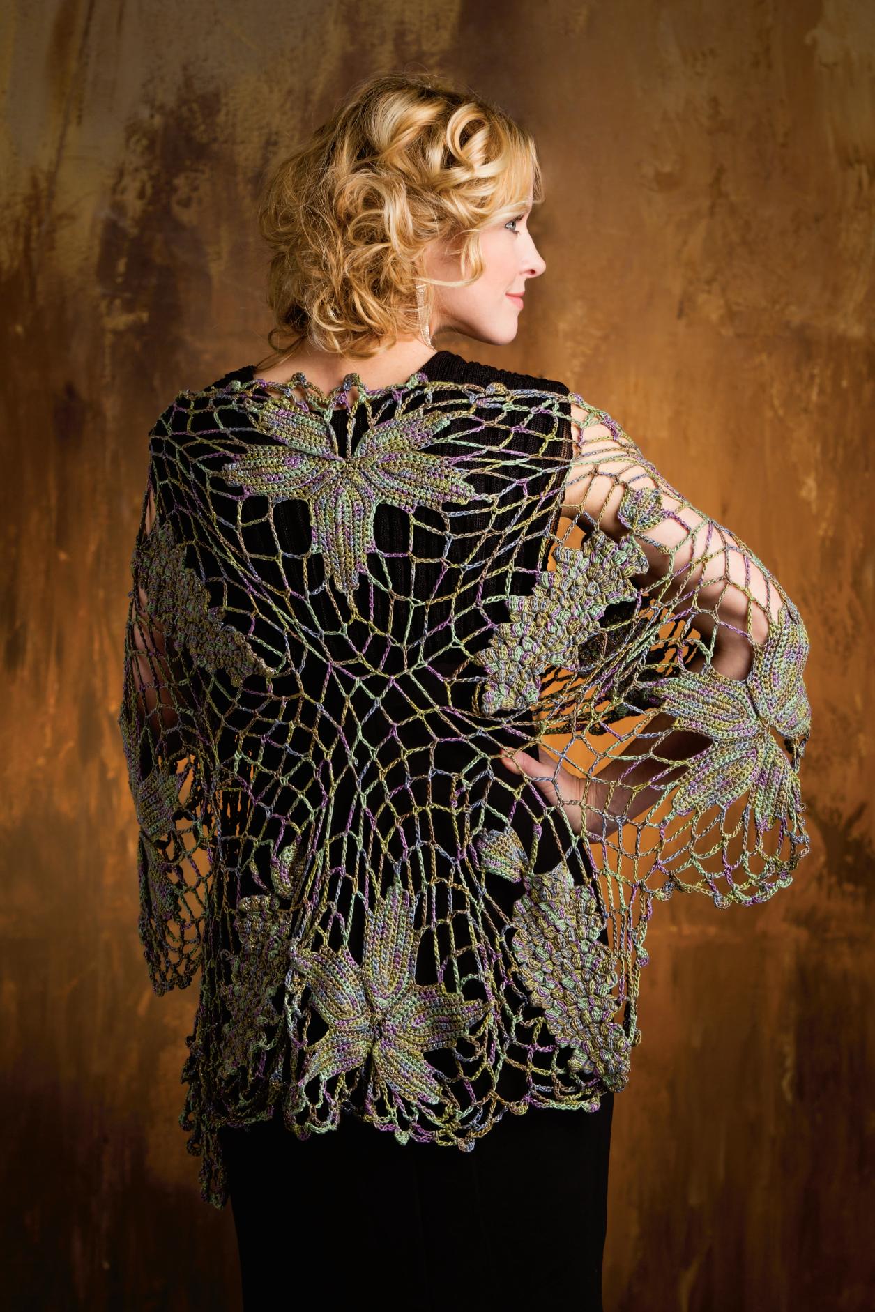
Vineyard at Dawn Shawl (back), Crochet! Magazine Spring 2013
Photo courtesy of Annie’s
Finally, thirdly, cost. I like to think of myself as spend conscience. I always looked at the cost per yard to find my best value (I admit I still am very aware of this even today). However, over the years I have come to realize that quality can make a really difference in my end product. Often the yarn can make or break a design. I use my Vineyard at Dawn Shawl (pattern in Spring 2013 Crochet! Magazine) as an example (created with a Blue Heron Rayon/Metallic), it has great drape, and is just striking, but if it were worked up in a chunky yarn it would have a very different effect, imagine it in soft, fuzzy mohair, which would be a different effect as well.
So, while these three obstacle where in place, I never tried luxury yarns or even wools for that matter until the last decade or so. When I first attempted wools, using my value shopping method, I found fibers that were not the most ideal. It worked up like I expected wool to, scratchy, itchy, and somewhat stiff. It played into all my negative preconceptions, but the more I learn out fiber the more I realized that not all wool is created equal.
Basically saying “wool”, is like saying bouquet, while terms like Merino, Shetland, and Romney are names of the flowers. These “flowers” have different properties that offer a different quality to the yarn. They have different degrees of softness, of loftiness, of felting ability, of amount of twist in the end yarn, and of durability. I won’t pretend to be an expert in know all the differing qualities of wool breeds, but I do know that the differences are there and can really make a difference in the end quality of my work.
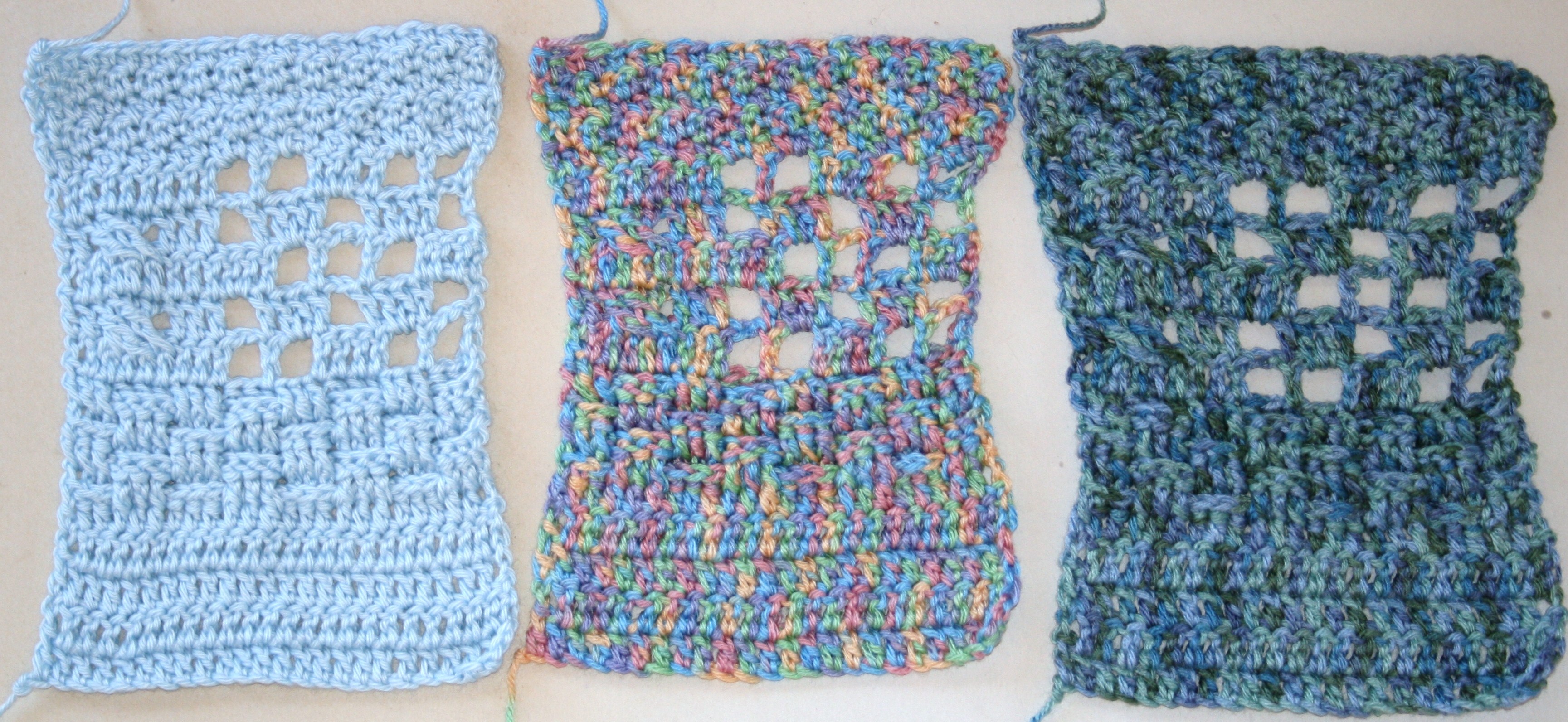
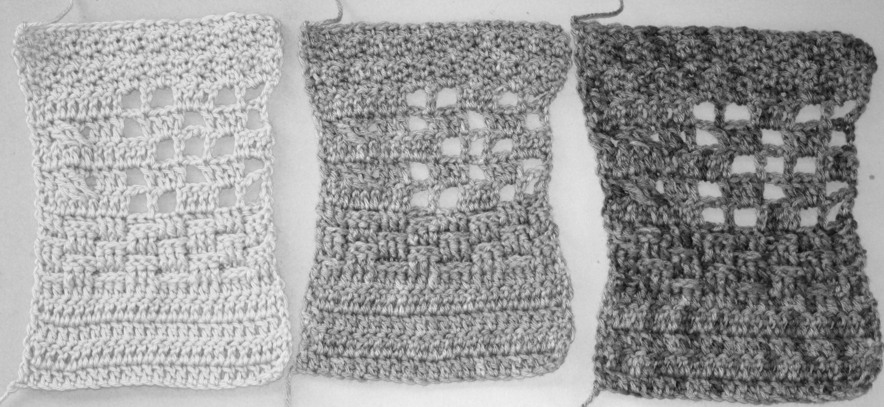
 One of the first grading areas is the diameter of the individual fiber. The smaller the measurement in microns the finer the yarn, for example Superfine Merino might have a range of 15.6-18.5 microns, while carpet wool can have a measurement of 35-45 microns. This is before they are spun into yarns, so basically the larger the individual fiber the courser it will be. This alone can create many differing yarns out of wool, but then there are other properties such as crimp and staple length that play into a yarns texture. So you cannot take the term “wool” on face value, different wool breeds react differently (even to felting, some felt very little and others felt just by looking at a washing machine). I guess like most of us, there is more than meets the eye.