 It has happened to many times; a marriage between a beautiful yarn and a wonderful pattern does end up as spectacular as expected. What could it be? Simply put not all patterns are designed the same. Sometimes you have a pattern that highlights the yarn, other times you have a yarn that highlights a pattern.
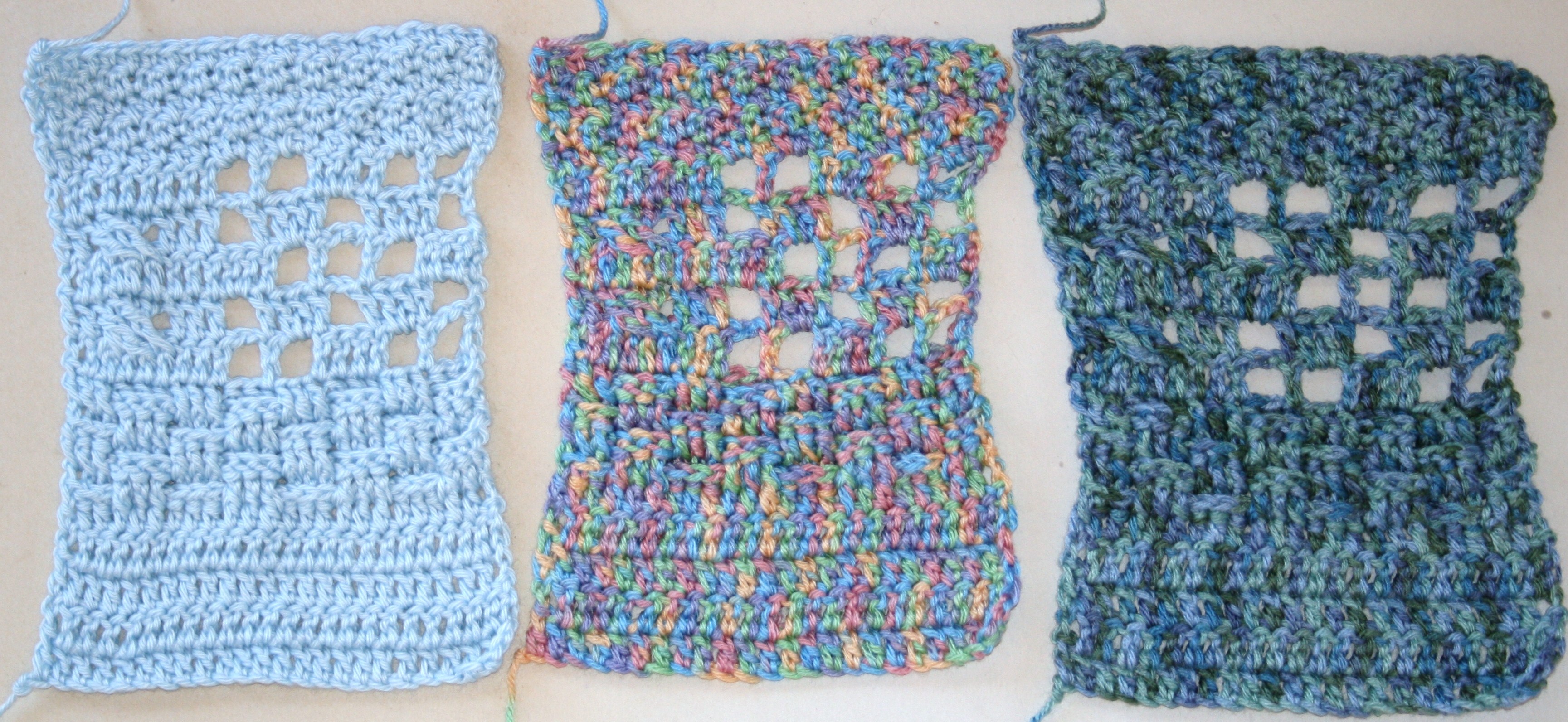
Same stitches, different tones and colors, notice the difference throughout each swatch, can you see the basket weave? Can you see the small cables next to the filet?
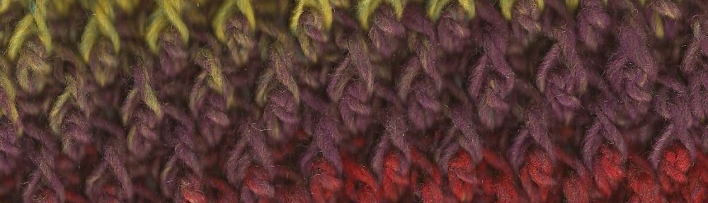
This usually comes into play with multi-tonal yarns and textured or lace patterns. The yarn draws so much attention to itself that is can lead the eye away from all the skill and technique you have put into cables, and popcorns, and filet work. The texture gets washed out and only the color remains.
This doesn’t mean that you cannot use multi-tonal yarns in intricate designs, but it is finding the correct match. Usually multi-tonal yarns need large designs, or large blocks of consistent stitches. By this I mean that they need solid spaces to let the color play do what it wants to, whereas a solid tone yarn can easily highlight more detailed textured stitches, such as posts and filets. Since the tone is consistent the eye is not lead away.
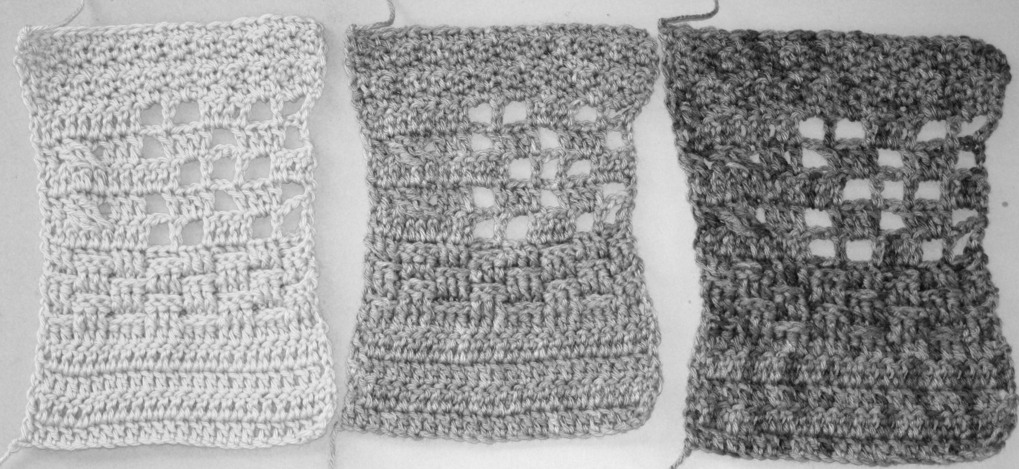
Review the same swatches with out the color and simply see the tone, do you notice a difference?
You are probably wondering why I’m using “tonal” instead of “color”; this is because more of the cause of effect is due to the tone not the color. The tone is what would be represented if the values were represented as black and white photographs. When looking at the tones of a color, green and red have the same value as a medium gray and yarns using these as a multi-tone will not be as eye distracting as a yarn using yellow and red. Since the yellow would generate a brighter value on the gray scale then red, it will draw the eye differently, and catch its attention. Give it a try with yarn in your stash, simply take a picture and convert it to black and white and see which yarn grabs your attention. Is it the same as the yarn when viewed in color?
The colors will also be varied in the grayscale values dependent upon the shade of the color, pastels are brighter then rich jewel tones for example, so that plays into the color play as well. The eye for color and value can be learned, it can be recognized. But it does take a conscience effort to find the match between the texture and the color. Keeping this concept in mind when matching your yarn to a project can really help to give you an end item that is the star of the show!